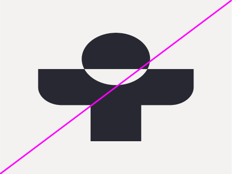
Logo
Our logo is a symbol that represents the Treated health partnership. It is a shorthand for what we represent and the service we offer.
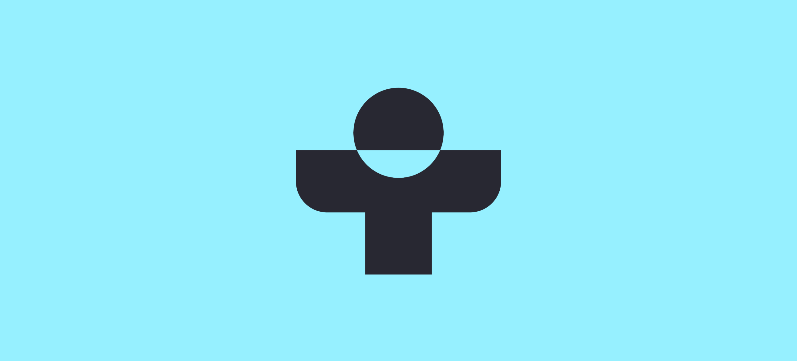
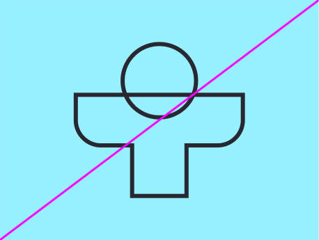
Logo mark
Our logo is a bold confident mark that is a symbol of health partnership. It is our primary logo and should be used in all brand applications.
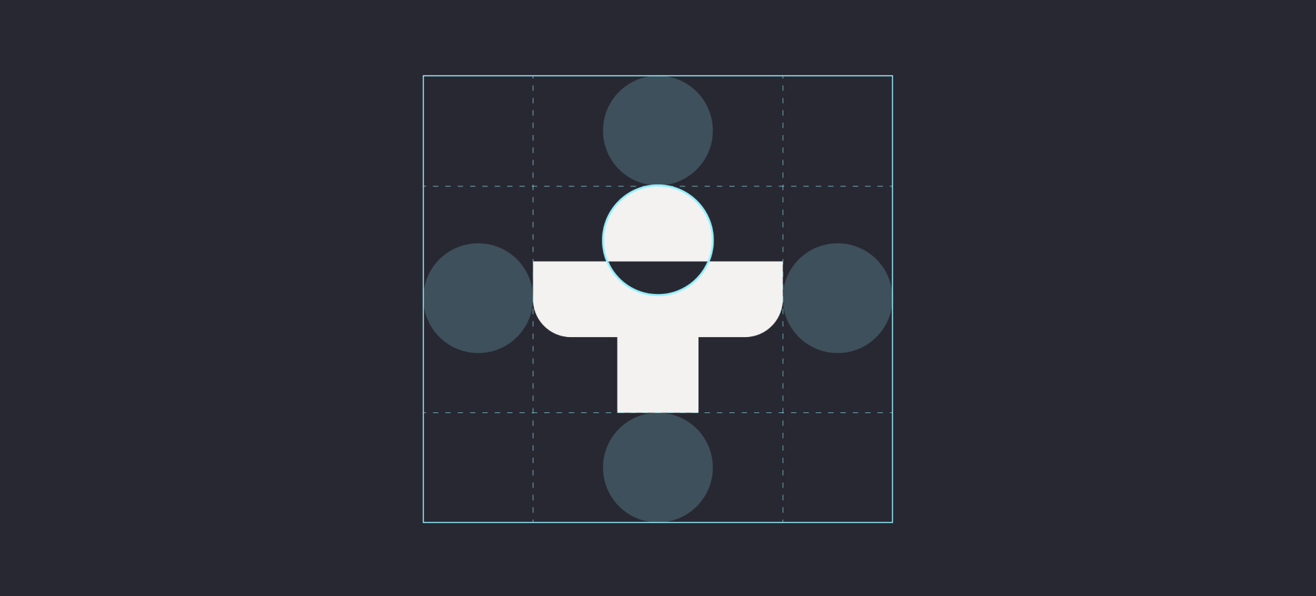
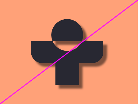
Logo resolve animation
Our logo animation is a shorthand for partnership and collaboration. It is used as a stamp of trust and a sign-off for brand applications.
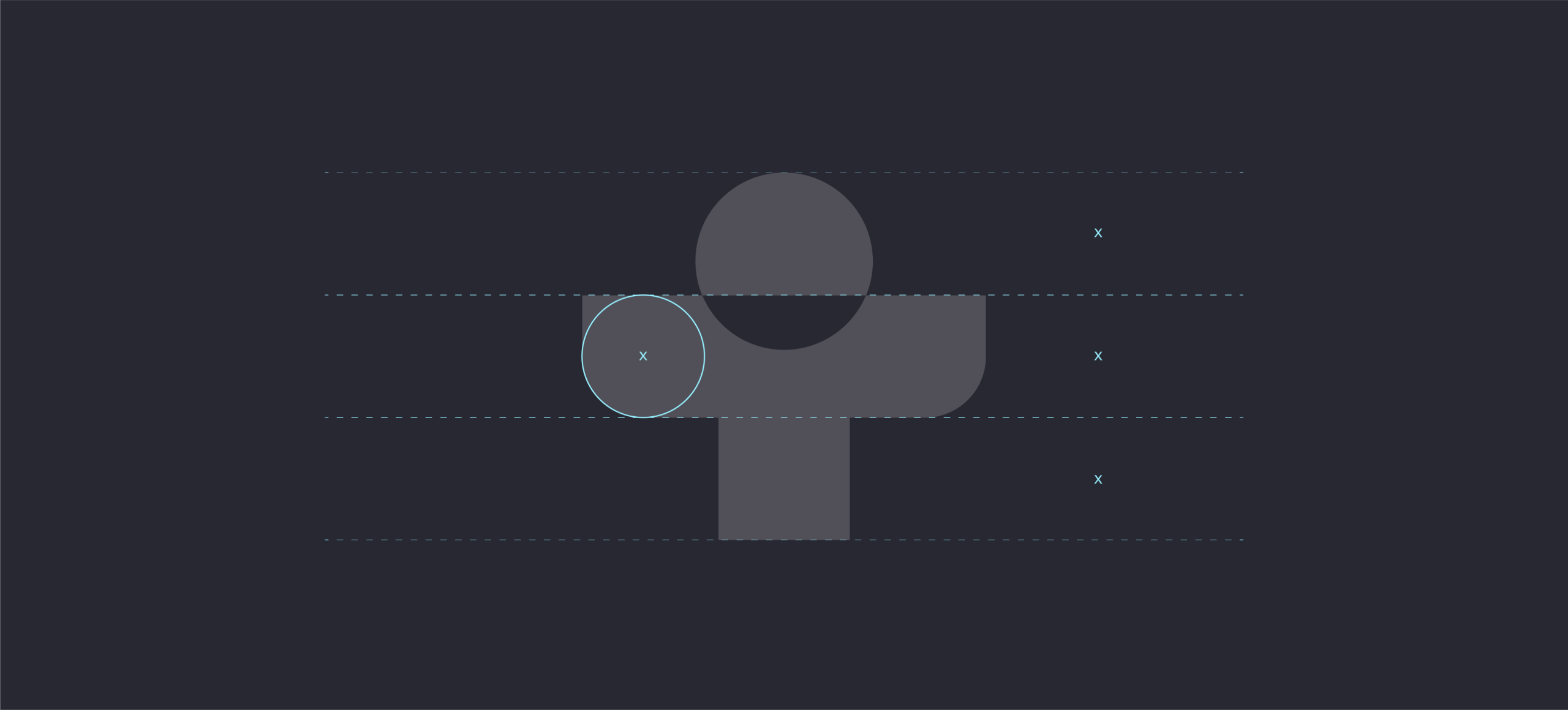
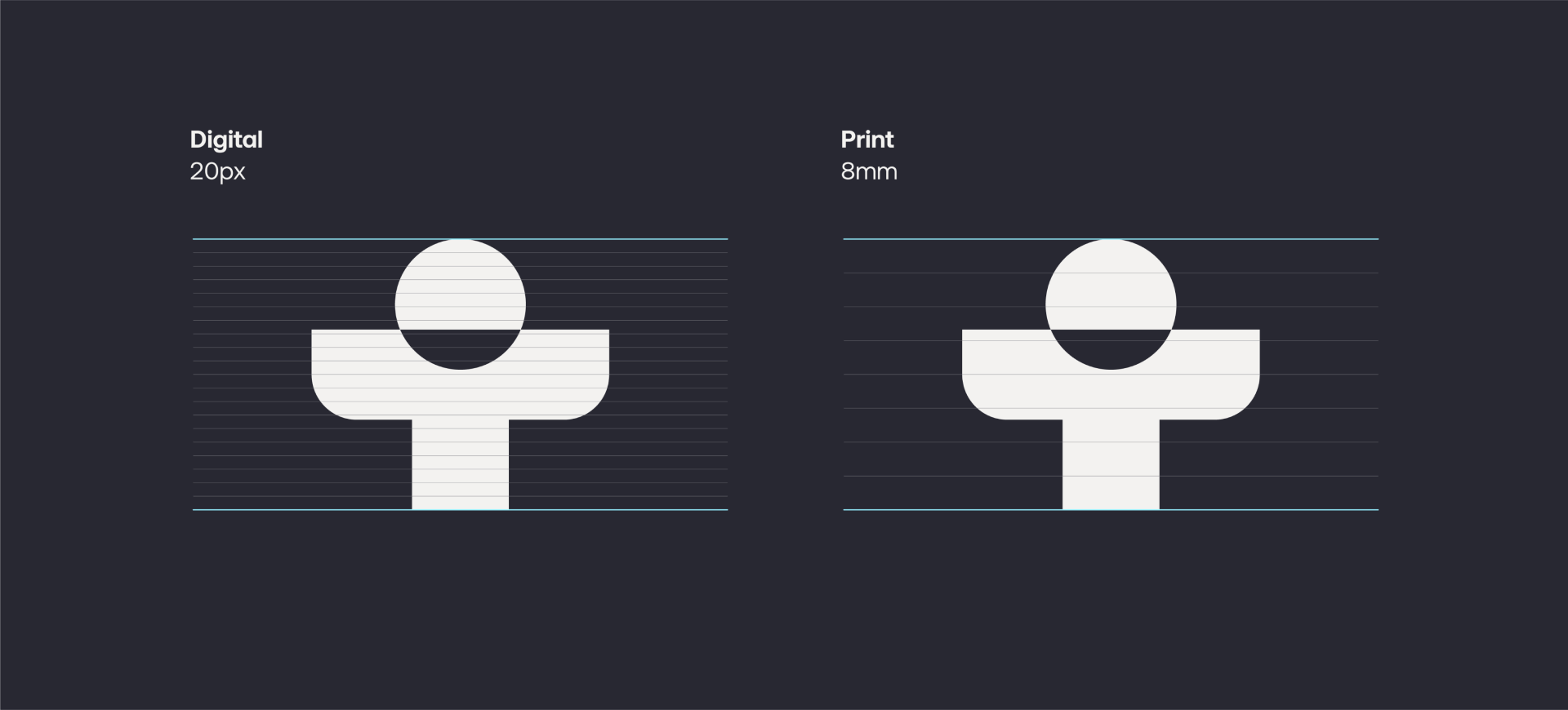
Logo usage
When using our logo, always give it room to breathe. A recommended clear space is indicated in the diagram below. Please always use the supplied artwork.
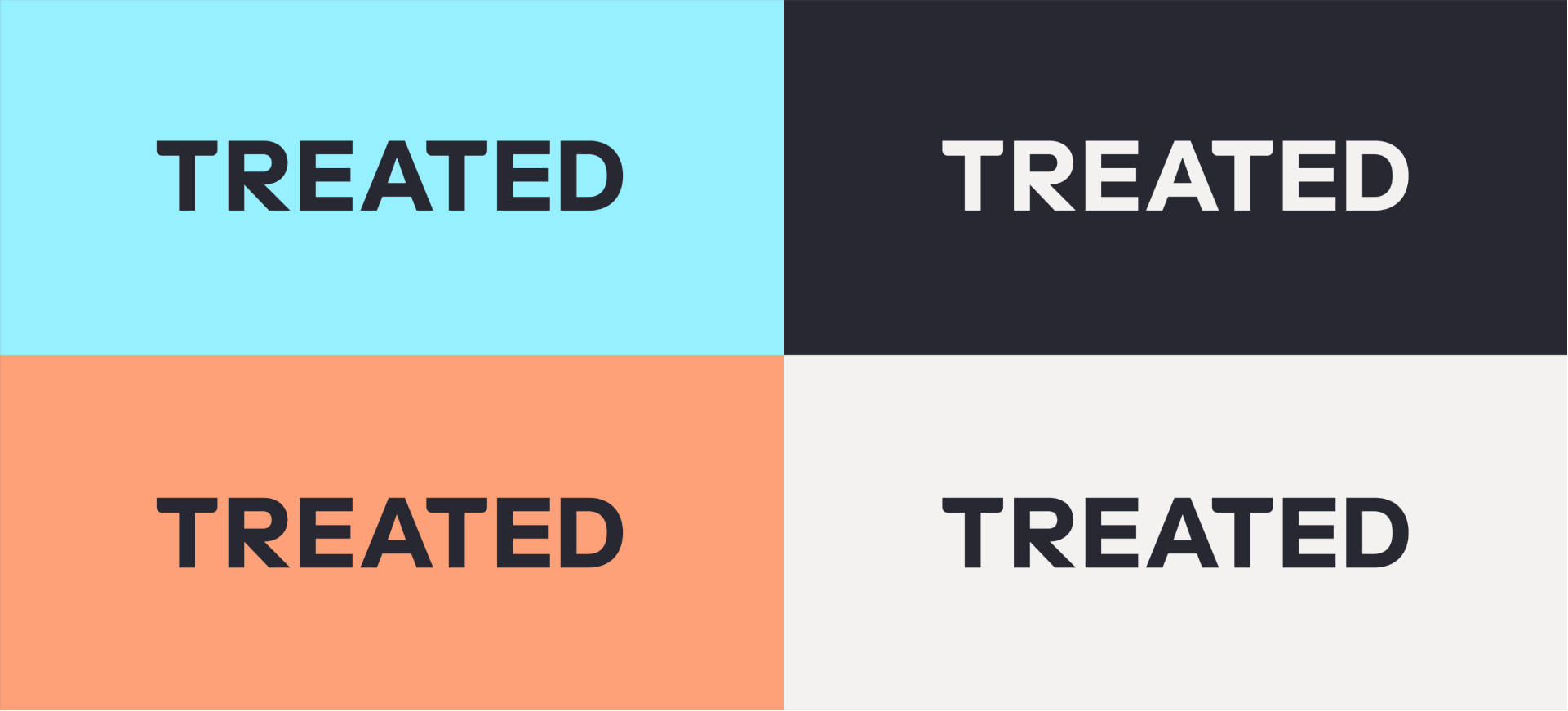
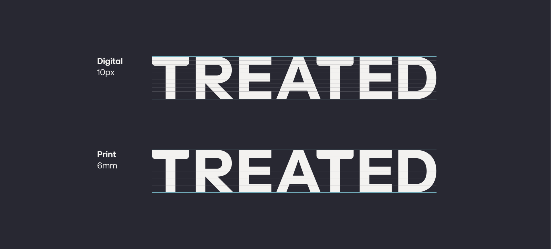
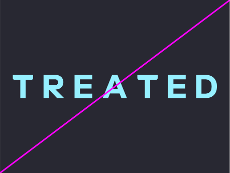
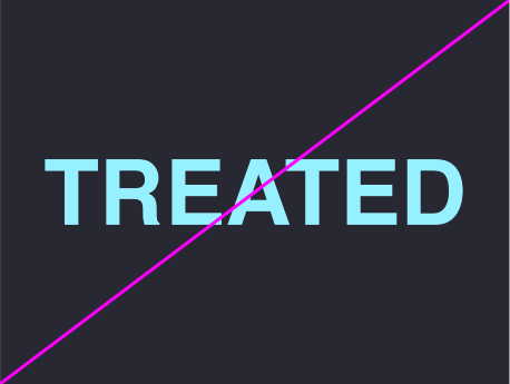
Wordmark
Our wordmark represents our name proudly. It is bold and confident, sharing visual characteristics with our logomark.
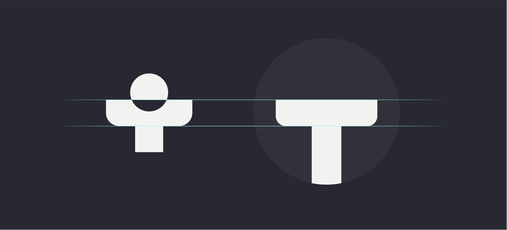
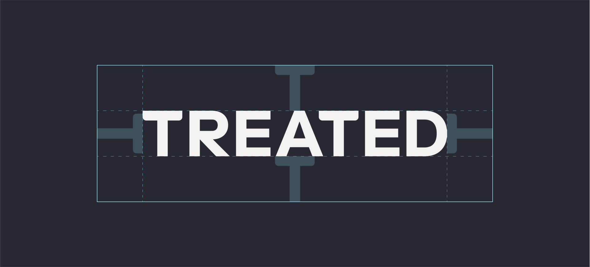
Wordmark usage
When using our wordmark, always give it room to breathe. A recommended clear space indicated in the diagram below. Please always use the supplied artwork.
Logo lockups
Our logo and wordmark are commonly locked up together. Use the portrait lockup for singular use and the landscape lockup when used as a sign-off.
Logo positioning
Our logo and word mark are commonly locked up together. Use the portrait lockup for singular use and the landscape lockup when used as a sign-off.
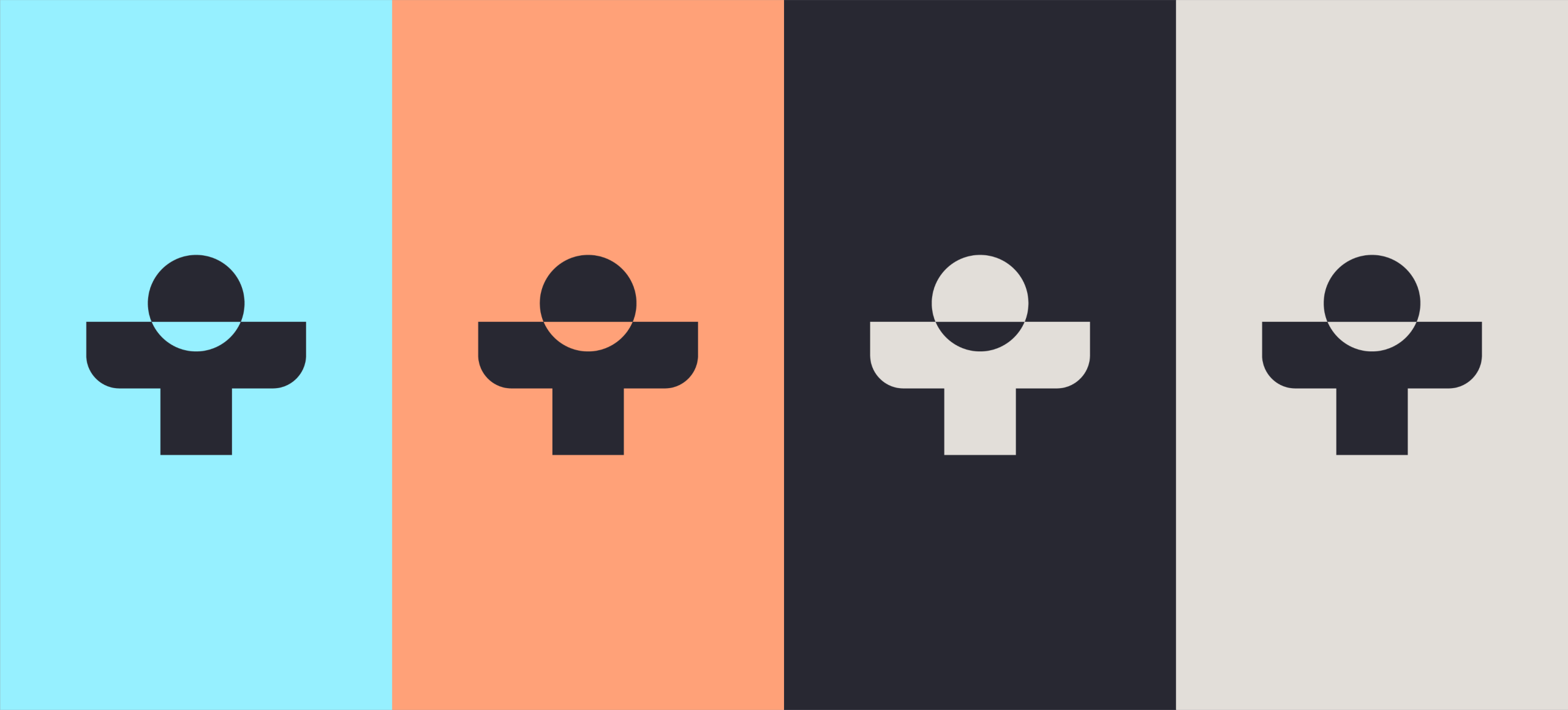
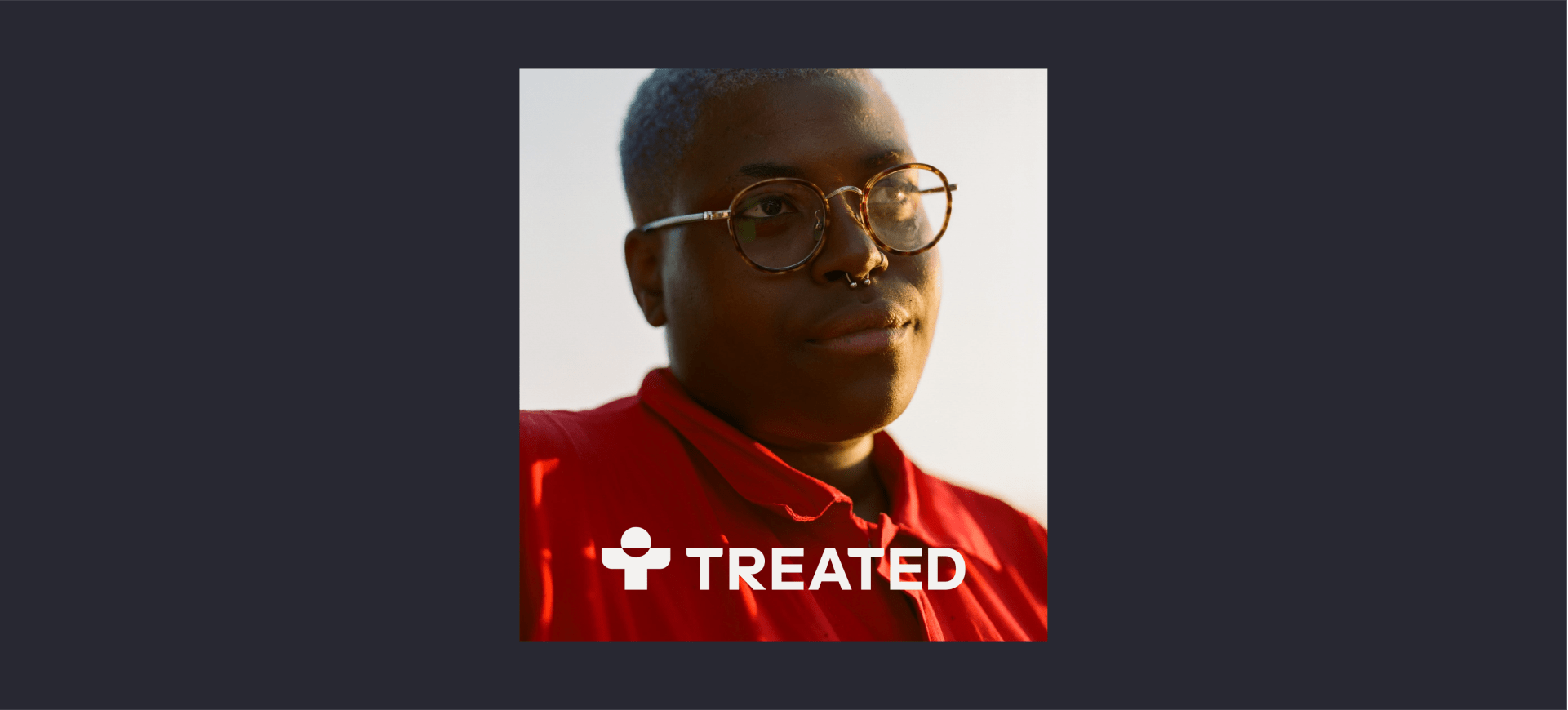
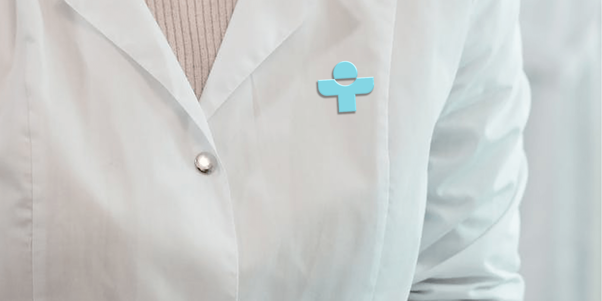
Logo on photography
Our logo can be placed over photography with or without a gradient overlay. Ensure there is enough contrast by using the light colour logo and making sure the photograph is dark enough.

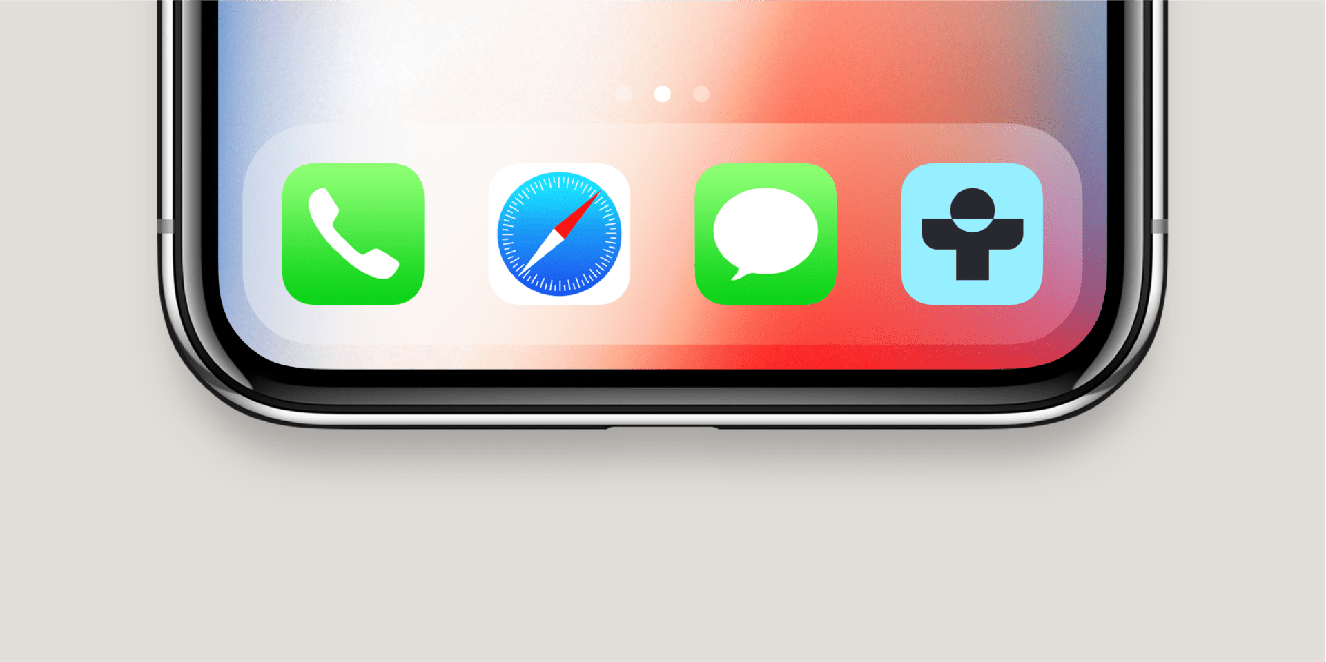
Logo in use
Things to avoid
Don’t outline or alter our logo artwork in any way
Don’t add effects or overlays to our logo
Don’t stretch or alter any of our logo assets in any way
Don’t rotate our logo
Don’t space the characters out or edit our wordmark
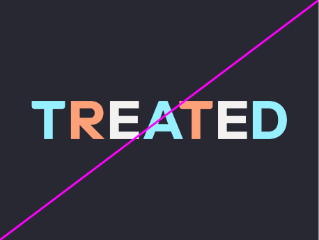
Don’t use multiple colours in our wordmark
Don’t substitute the wordmark with replacement type
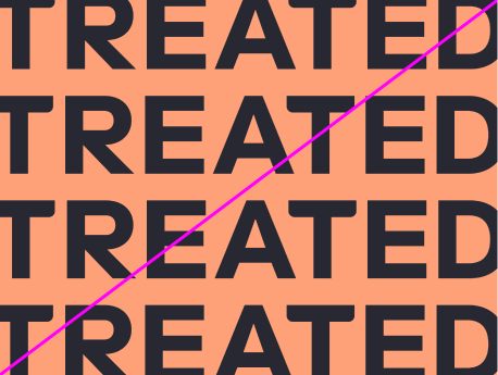
Don’t repeat our wordmark as a pattern