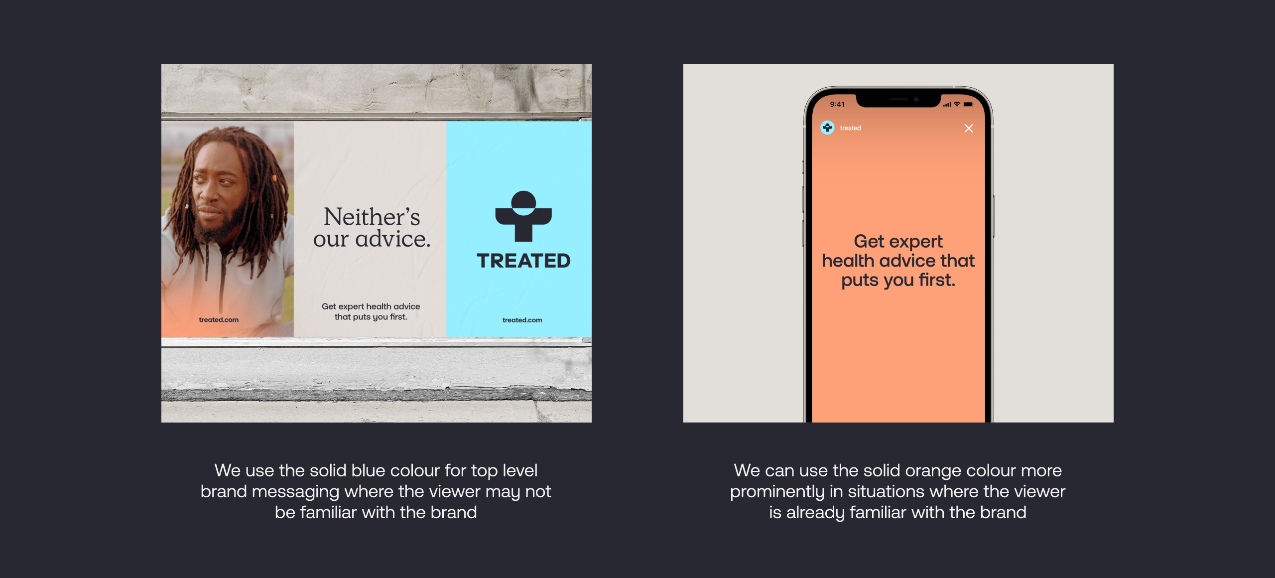
Blue
R 150 G 240 G 255
C 46 M 0 Y 4 K 0
PMS 310 C
#96F0FF
Orange
R 255 G 161 G 120
C 0 M 53 Y 50 K 0
PMS 1625 C
#FFA178
Charcoal
R 40 G 40 G 50
C 80 M 63 Y 34 K 73
PMS 4280 C
#282832
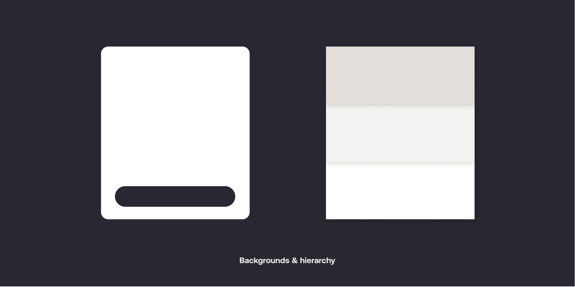
Mid Grey
R 226 G 222 G 217
C 14 M 12 Y 15 K 0
PMS Warm Grey 1 C
#E2DED9
Light Grey
R 243 G 242 G 240
C 8 M 5 Y 8 K 0
#F3F2F0