
Typography
Our typography represents the Treated voice.
It conveys both our warm, conversational tone with our clinical expertise.
Typography overview
A headline typeface that conveys the trustworthy Treated voice partnered with a modern, technical supporting typeface.
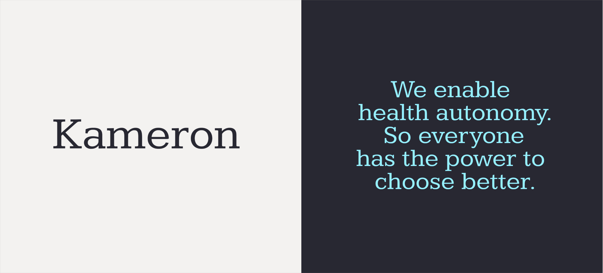
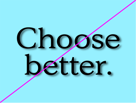
Headline typeface
Our headline typeface is characterful and warm featuring angular serifs and rounded forms. It represents the voice of Treated.
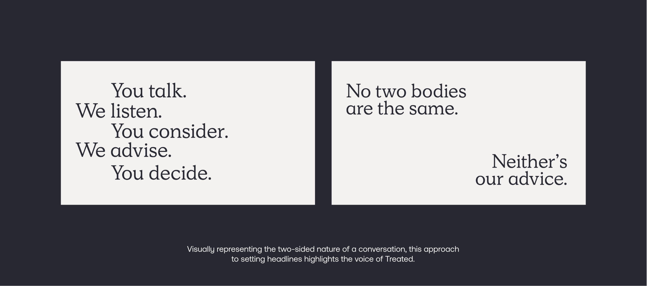
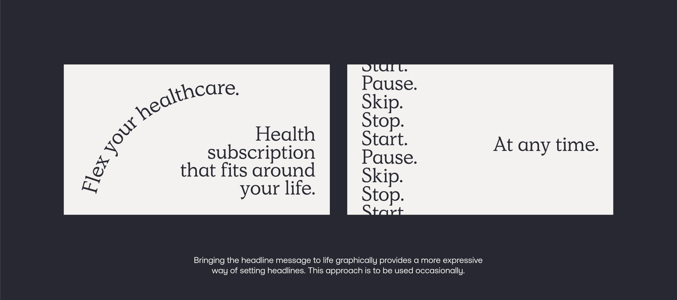
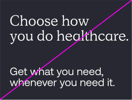
Expressive headlines
When we want to be more expressive with our messaging, we can arrange our headlines in the following ways.
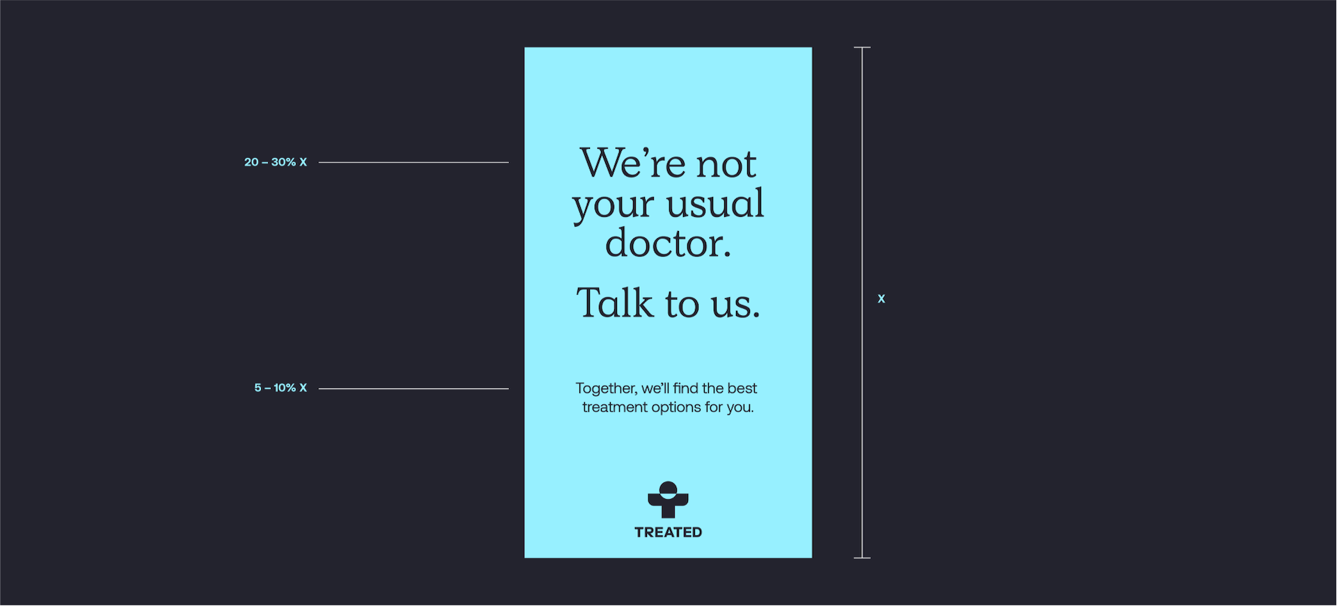
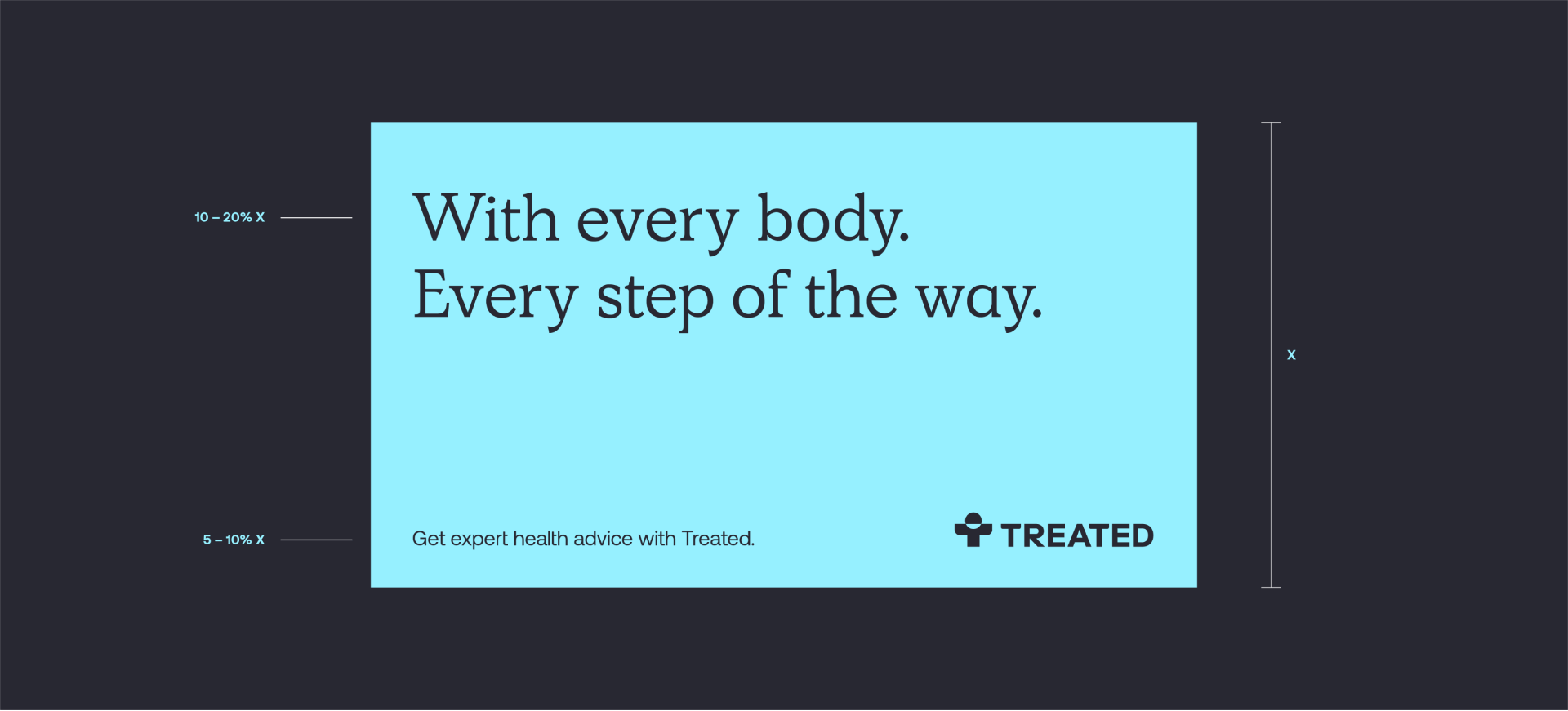
Setting headlines
When setting type, use this guidance to determine the approximate size of the largest headline size and supporting copy. It’s important to always retain a good level of contrast in sizes.
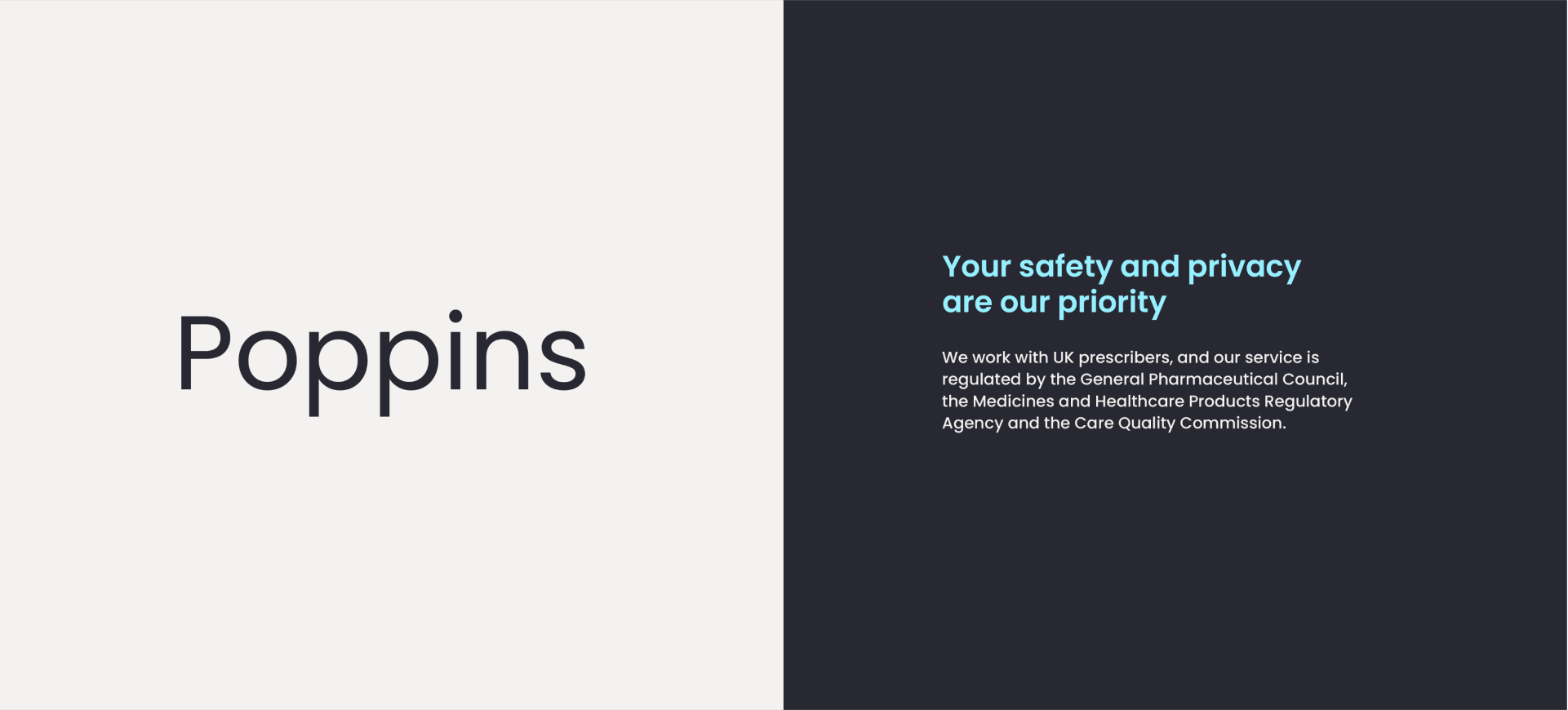
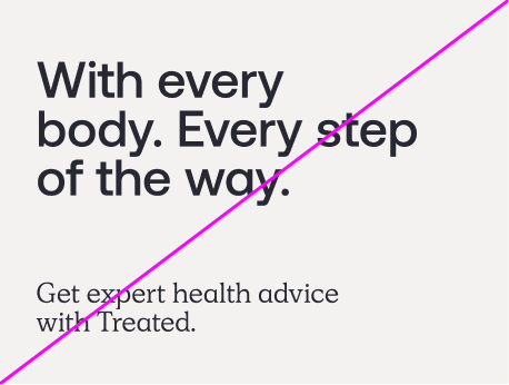
Supporting typeface
Our supporting typeface is hardworking and technical. It pairs well with our headline typeface and is highly legible at small sizes.
Type hierarchy
We use size and weight to define clear type hierarchies. The guidance below helps to maintain consistency across our headlines and body copy.


Naming convention
When using our name follow these naming conventions to ensure consistency.


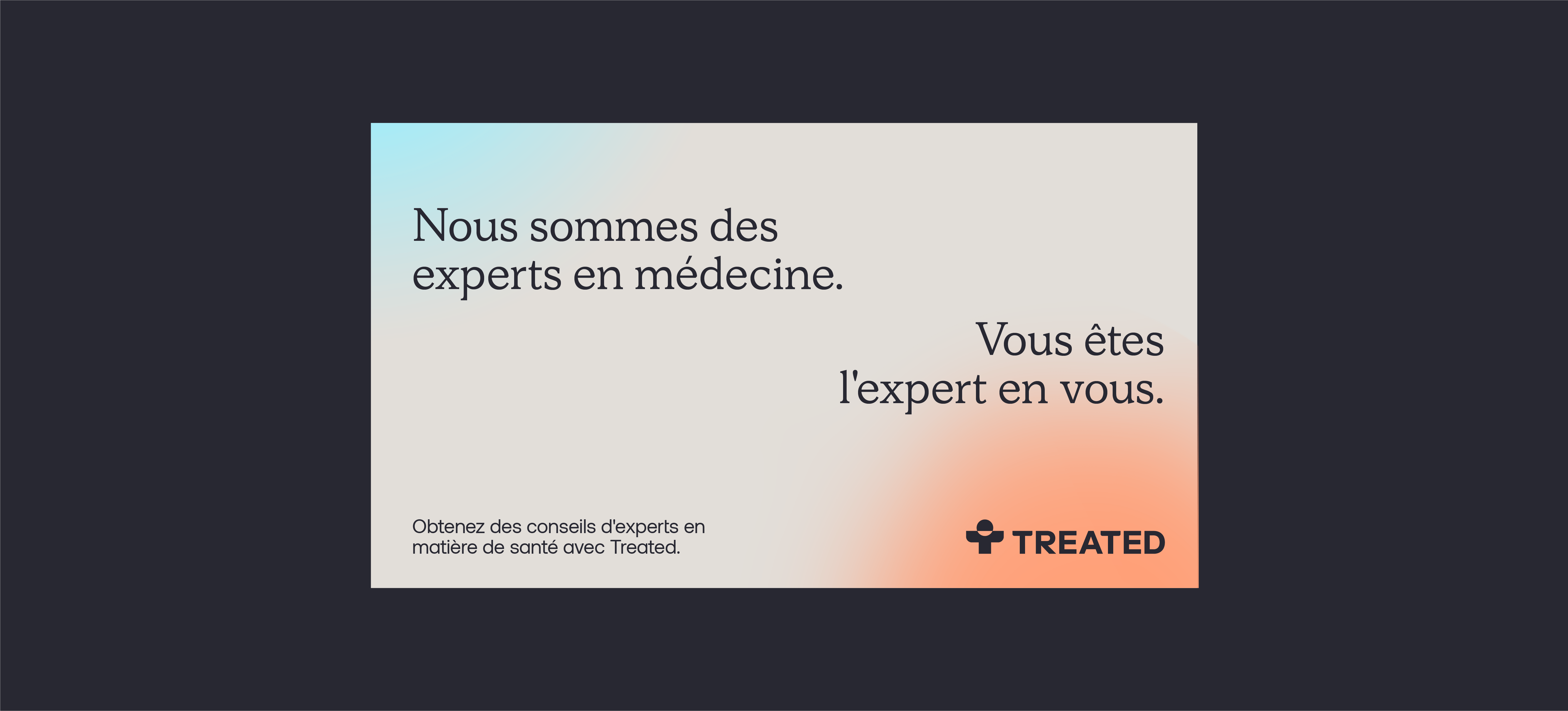
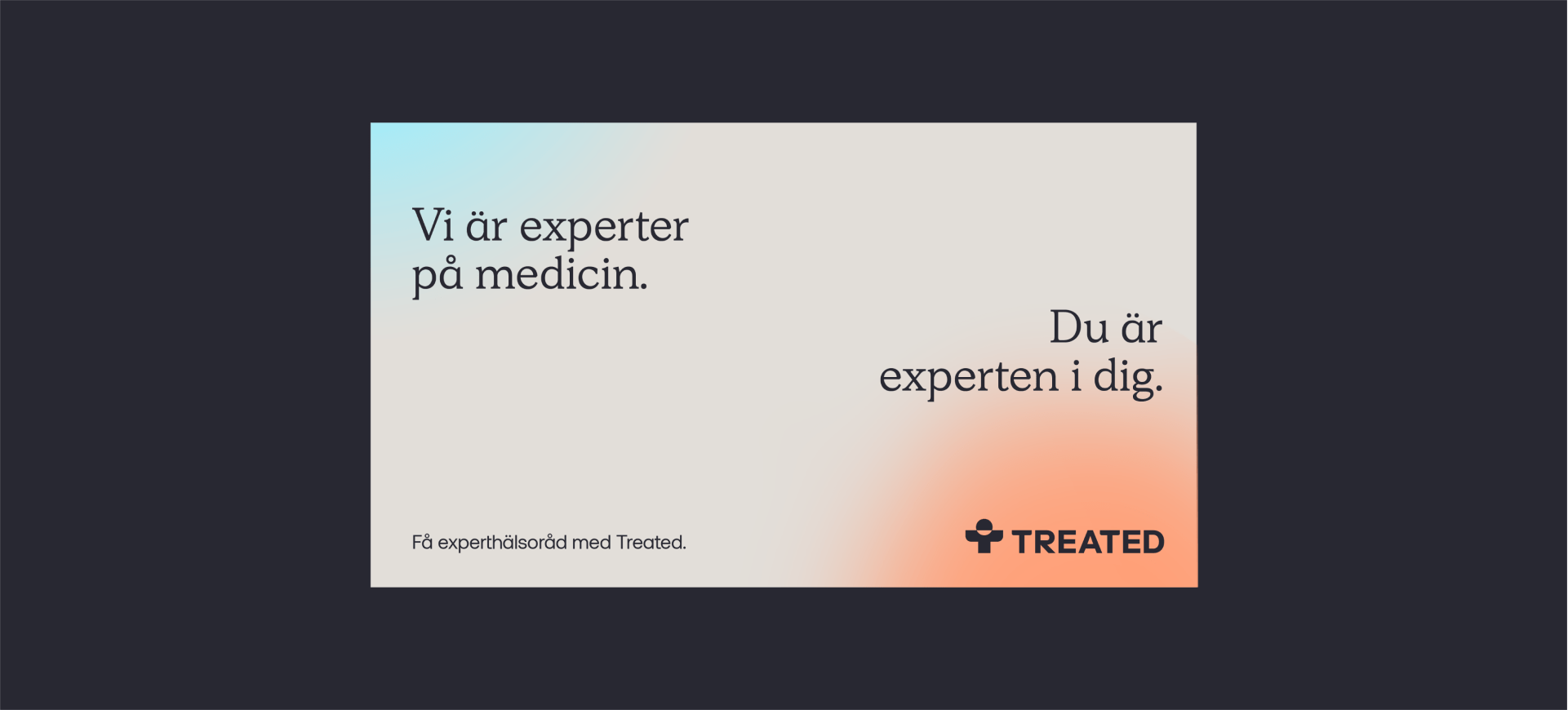
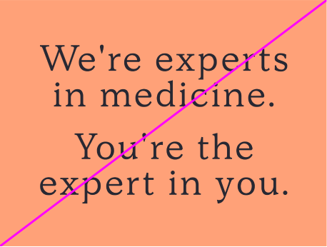
Language support
Our typefaces both support a wide range of languages. Here are some examples of messaging for international markets.

System typefaces
Wherever possible we should use our brand typefaces. When this isn't possible use the following system typefaces as a replacement. Both system typefaces are available from Google Fonts.
Things to avoid
01
Don’t stretch, distort or apply effects to type
02
Don’t use our supporting typeface for headlines
03
Don’t set headlines with a low amount of size contrast
04
Don’t track type or apply leading outside of guidance