
Iconography
Our icon style is distinct and incorporates the visual language of partnership with overlapping forms.
Iconography & pictograms
We use two different types of icons: UI and pictorial. Our UI set are minimal and are used in functional settings. Our pictorial set are used in place of illustration when we need to describe conditions or services.
Iconography overview
Our icons have a simple and distinctive style that embodies our message of parnership by using overlapping forms.


Icon principles
When creating new icons please follow these principles as a guide so that they all feel consistent.
Icon creation
Follow these steps when creating new icons.
Icons usage examples
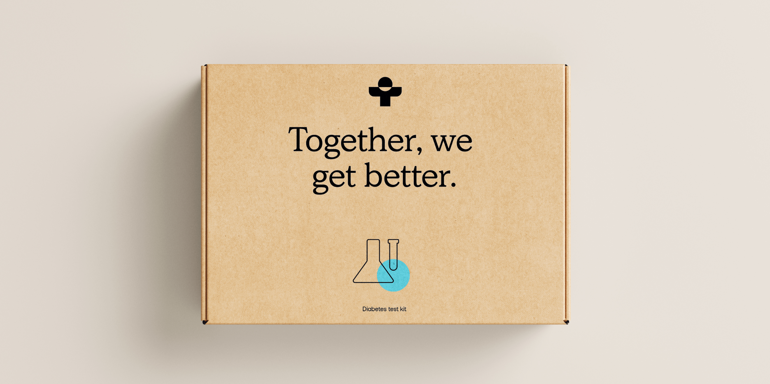
Pictograms overview
Our pictograms are used in place of illustration and depict the services and treatments we provide. The highlight colour which overlays the line drawing can appear in either our blue or orange.


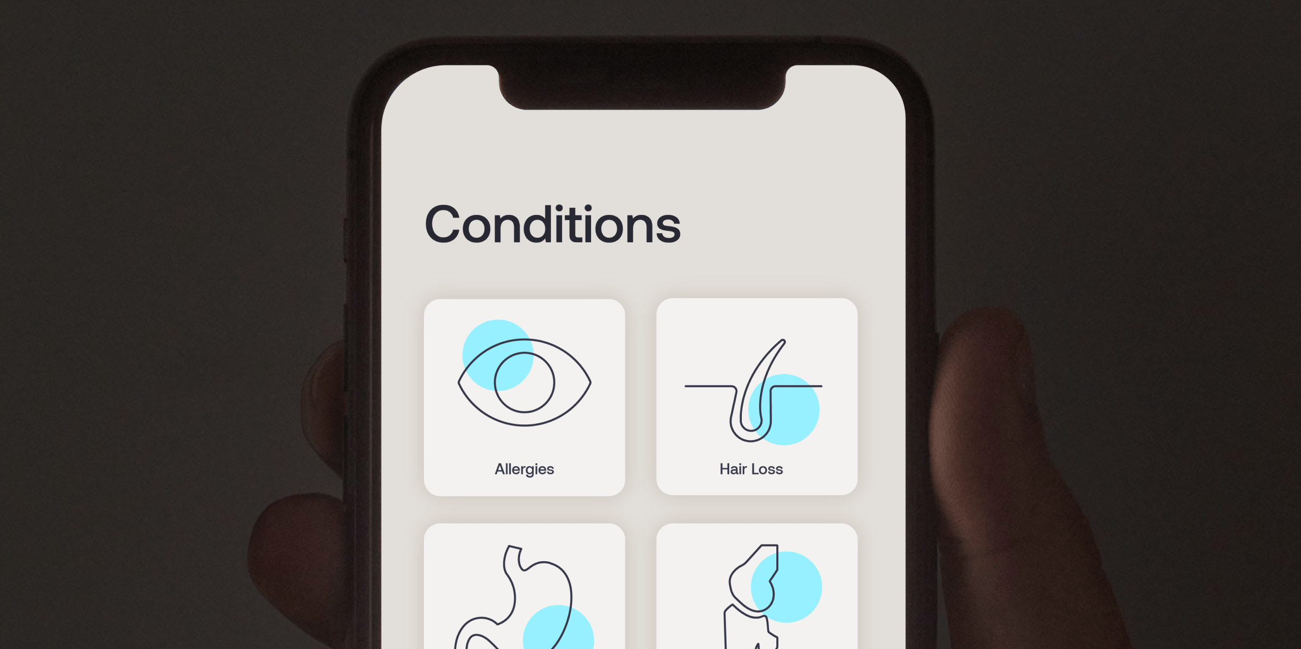
Pictogram usage examples
Things to avoid
01

Do not use different line weights
02

Do not make icons too busy
03

Do not fill in the icons
04

Do not create icons without a grid
05
Do not use any colour other than Treated blue for highlight spot
06

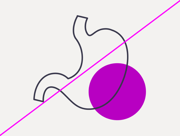
Do not place the highlight spot without a crossover
07

Do not place the highlight over the stroke
08

Do not fill in the pictograms